Make every email work on small screens
Your desktop design is only half the picture. Mobile View Controls let you fine-tune how an email looks on a phone, with separate styling for supported sections and elements.
What's new
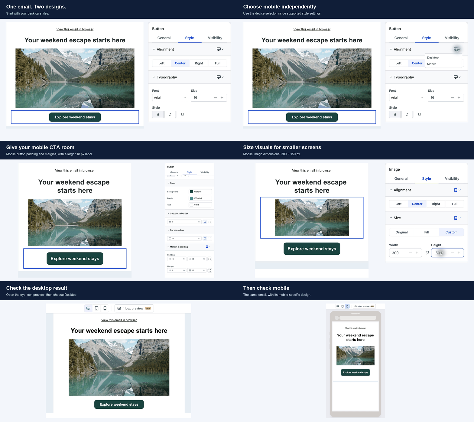
Design for desktop and mobile independently: Switch between Desktop and Mobile within supported styling sections. Mobile settings inherit your desktop design until you change them, so you can make targeted adjustments without rebuilding the email.
Give content room to breathe: Adjust mobile padding and margins for sections and supported elements. Tighten oversized gaps, add space around content and shape the layout for smaller screens.
Make your call to action stand out: Choose mobile button alignment, including full width, and adjust button typography and spacing so the action is easy to see and read.
Keep visuals in proportion: Set mobile alignment, dimensions and padding for images, logos and videos. Aspect-ratio locking preserves proportions. Social icons also get mobile alignment, size and spacing controls.
Why it matters
A layout that looks great on desktop may need different spacing or a wider button on a phone. Now you can make those adjustments in the same email while keeping your desktop design intact.
How to use it
Go to Marketing > Emails and create or open a campaign or template in the Design Editor.
Select a section or a supported content element.
Open Style and use the device selector beside the setting you want to change.
Choose Mobile, adjust the values and review the mobile preview.
Save, click the eye icon to open Preview, then switch between Desktop and Mobile to review both designs.
Good to know
Mobile styles inherit desktop values until you change them.
Existing campaigns and templates keep their current appearance unless you update their mobile styles.
Controls vary by element. Use the device selector where it's available.