January 13th, 2026
Improved
Contacts
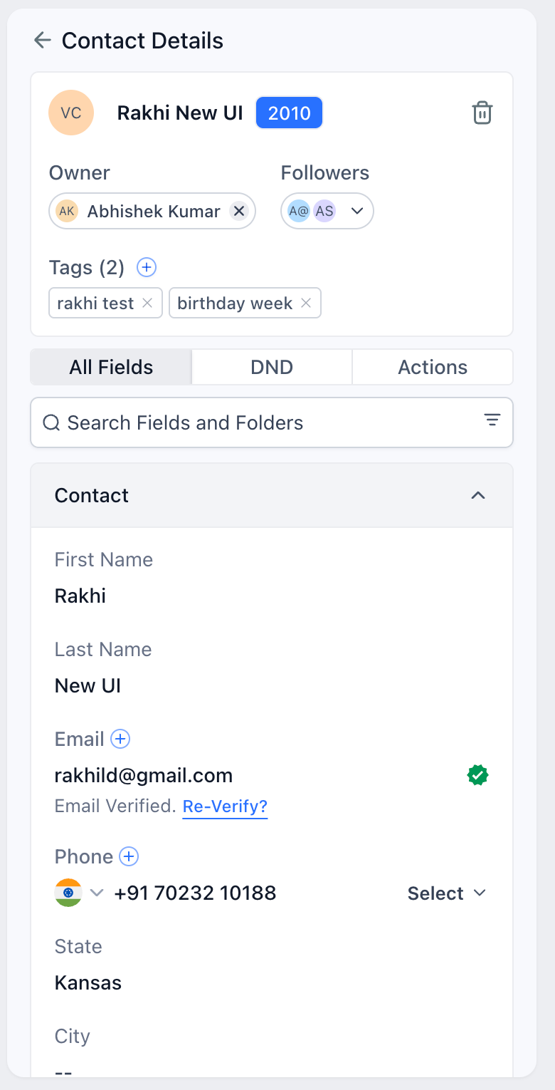
Contact Detail Page Redesign
This release improves overall UI clarity by enhancing color contrast, increasing feature visibility, and optimizing the placement of key page elements.
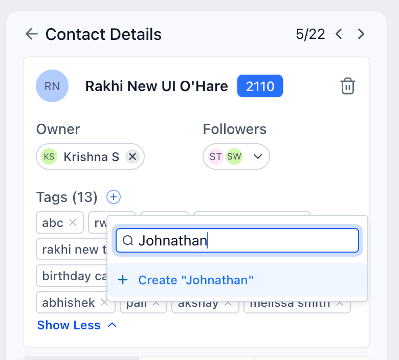
The functioning of the page remains the same overall. Users can now create new tags from the contact card section.
What’s New in UI
• Color Contrasts and Better Visibilty
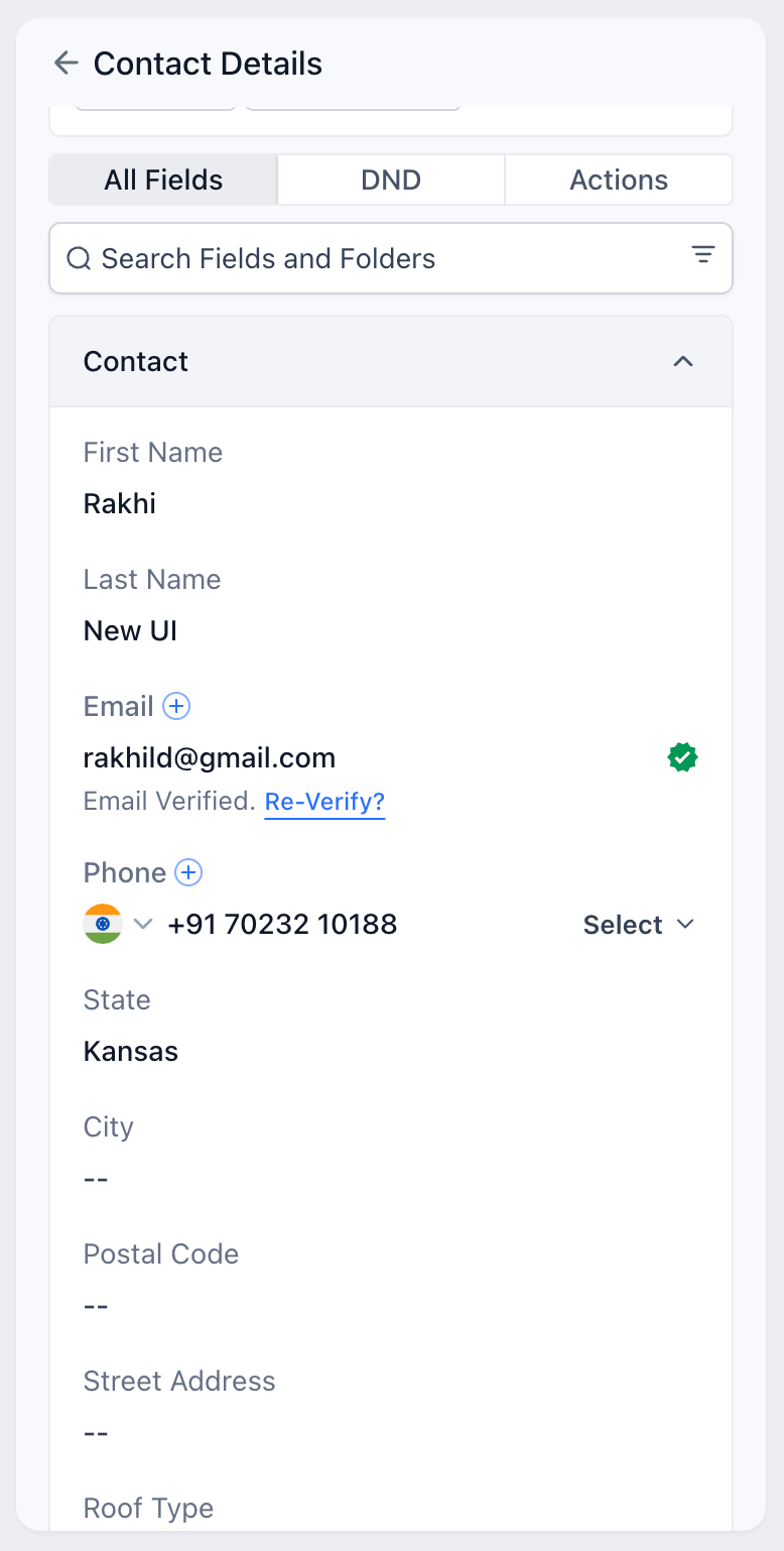
Input fields have been made darker to make them stand apart from their respective field names (two shades of grey lighter). Customers can now easily differentiate this change as it was visually disturbing earlier
• Empty Fields
Fields without input are indicated by double dashes, and the color of input fields has been adjusted to be slightly darker than the field text to enhance readability.
• Folder Colors
The UI displays the folders with a grey background to differentiate between the existing fields and folders.
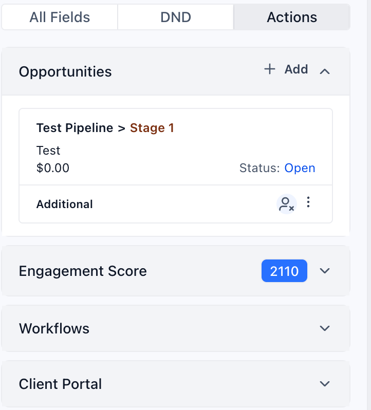
• Opportunities moved under Actions
This was the most requested feature. Customers wanted a simpler way to view and add new opportunities, and the new flow significantly reduces both the number of clicks and the time required. The entire card is now clickable.
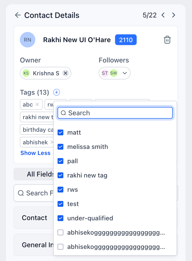
• Tags Display
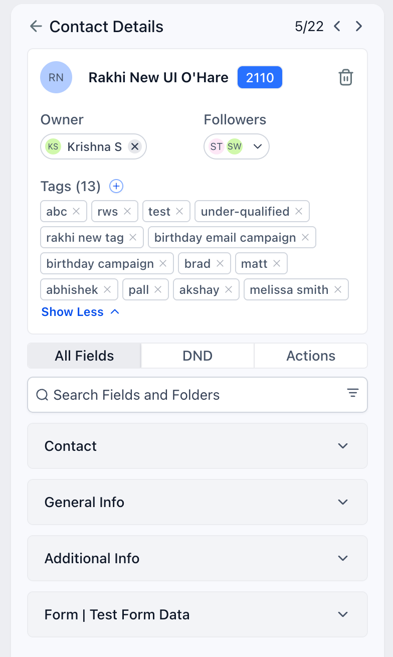
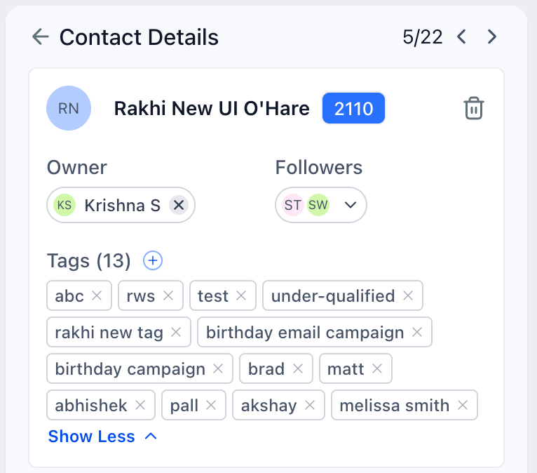
Tags addition pop up made wider and cleaner. The tags are now displayed completely. We can now expand and collapse the tags section
• Engagement Score
The score is now displayed next to the contact name in the contact card. On click of this score, it opens the engagement score section.
• Add Additional Phone and Email
This feature now resides inside the contact folder. Users don't have to search on the folder name anymore.
• Delete Contact
To improve usability, the three-dot menu on the contact card has been replaced with a delete icon, reducing the effort required to locate the delete action.